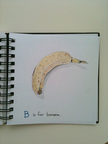
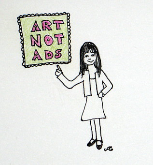
Showing posts with label art. Show all posts

03 September 2013

Blackout Poetry


popular art
I've been experimenting with some "blackout poetry" recently. You take some random paper-based text (e.g. a newspaper, magazine, whatever) and black out words until what you're left with is a poem or amusing sentiment. The one above reads: "popular art must be nourishing to people. the absolute ideal art form to sum up the world. explicitly."

Since I don't have much random English text available, I bought a cheap paperback (Sophie's World) at my beloved thrift store and have been destroying it for Art and Poetry. So much fun!


everyday life

You can see my whole set of blackout poetry on flickr. I don't think I'm done with this yet. It's a challenging constraint to play with.


doubts went even deeper


Photographs and artwork by Allison Gryski. © All rights reserved.

02 August 2013

Haiku Postcard


haiku postcard
An awesome friend of mine suggested doing a haiku postcard exchange. This is what I came up with. I have forgotten everything I learned about my watercolour paints, so come September (and the Wee Lass begins preschool), I have artsy plans for myself.

Here's a sketch I did as part of the series of motherhood inspired haikus:

motherhood

Photographs and artwork by Allison Gryski. © All rights reserved.

21 March 2013

Lost Buttons


lost buttons

I like to pick up lost buttons on the street. These are the ones I've found so far. I started shortly after moving to Amsterdam. I think one or two may have been picked up while on holiday, but I decided early on that I couldn't be bothered to keep track of where each button was found. I was not surprised to discover that more than half of the buttons I've found are black. There are 3 metal buttons and 2 wooden ones. The purple heart-shaped one is the only non-circle I've found. Do you collect anything unusual?

Photographs and artwork by Allison Gryski. © All rights reserved.

06 May 2012

Studio Sunday

Today was my first "Studio Sunday", also known as "Daddy-Daughter Day". My two sweeties went out to the park and grocery store while I got to have some time on my own to create.


Beginnings of Bunting

I started a project that I've been thinking about since before the Wee Lass was born.... Some pretty bunting. I originally planned to put it in her room, but I think it may end up in the living room. One of the things we couldn't reasonably bring with us overseas was our art, and our plain white walls are looking especially bare since I took down the star garland after New Year's.

I still have several more flags to make before I assemble the bunting. It was a glorious couple hours playing with my fabric. The plan is to have Studio Sunday every other week, and I'm looking forward to that time especially reserved for creative pursuits. Laundry is to be strictly ignored!

Photographs and artwork by Allison Gryski. © All rights reserved.

21 July 2010

A Monster at Breakfast


"breakfast"


He had a monstrous appetite in the morning.


Photographs and artwork by Allison Gryski. © All rights reserved.

29 June 2010

Salutations from a purple-suited alien


"satellite"


This week's IF theme is "satellite", so perhaps it's no surprise that the purple-suited aliens have made another appearance. The story for this one: "The scientists assumed the strange satellite pictures were some kind of elaborate prank."

Photographs by Allison Gryski. © All rights reserved.

25 June 2010

Desperate measures


"security"


I've started accompanying some of these paintings with little one sentence stories. This one allowed me to be exceptionally silly. So silly that I needed an extra sentence.
The nefarious baker had to resort to desperate measures to prevent the heroes from stealing his cake and eating it too. The Nefarious Baker was an Evil Ovenlord who ruled with a heart of Ice (Cream)!

For some reason, my pen wanted to run rather more than usual on this painting. I suspect it's just not that waterproof, so I may have to find a new pen for using with paints. Too bad since I really like the feel of drawing with this one. One gets very picky about art supplies. I noticed this when I was trying to replace my small sketchbook (it's full) and didn't like any of the options. I love that's it's square, since it feels less cramped than a rectangle, but it's still small. Also, while I like the look of bound sketchbooks, I prefer coils so that I can open it fully flat with no fuss.

Photographs by Allison Gryski. © All rights reserved.

23 June 2010

On one planet, it rained paisley.


"paisley"


I wasn't too enamoured of this week's IF topic of "paisley" at first. I prefer the very abstract themes. But after doing a little mind map brain-storming, it turned out that you just can't predict inspiration. I'm really rather loving my little alien, who seems to be turning up all over the universe. I have a sneaking suspicion that my subconscious produced this little purple-suited alien because I have some fellow-feeling for a being in strange new surroundings.

I think there must be several of them on that pink flying saucer and they're on rather a long holiday, adventuring round the universe. They stopped by Earth for some ice cream, and blew some bubbles as they left. Here, one of them is rather surprised by the form precipitation takes on an otherwise ordinary blue-green planet.


Photographs by Allison Gryski. © All rights reserved.

20 June 2010

Some days are better than others


The owl and the pussycat


I struggled with this painting. It just didn't want to come out how I was picturing it. My sweetie was very helpful with some constructive criticism. At first my cat totally looked like a mouse. I did some fixing and now it sort of looks like a cross between a cat and a bunny. Oh well. In addition to the mouse-y cat, it was originally very flat-looking, so I added a defined horizon line and a bunch of shading to the boat. Later, I twiddled with the water, adding some more shading and a bit of green and pink around the boat. And I spontaneously added a fish to balance the composition. I decided that I was satisfied enough with it that I'd better quit before I futzed with it anymore. While I'm working on something is when I tend to feel most critical of it, since I'm focused on all the bits that aren't turning out how I wanted. Usually it grows on me later. And in any case, it's all good practice with my new paints.

Photographs by Allison Gryski. © All rights reserved.

17 June 2010

Update on the Ripple Project

My Brown Pelican illustration is up on the Ripple project. It's number 436! I think it's wonderful that so many illustrators have come together and it's so fascinating to see all the different ways people have responded. This one of a little girl rescuing a fish in a bucket is so cute! And here's one by another artist in the Netherlands who painted the Brown Pelican. Or there this one of a mermaid with a dark, creepy edge to it.

16 June 2010

A ripple in the ocean


"ripple"


This week's IF topic was "ripple". I did a cheerful interpretation first, but then I learned about the Ripple sketches project, which is raising money for helping the creatures affected by the Deep Water Horizon Gulf Oil Spill.

The idea is that artists create a small artwork on the subject and the works are available through the Ripple project for a mere $10 donation to The Institute for Marine Mammal Studies or The International Bird Rescue Research Center.

My art tends to come from a happy place, so I did not find a sad and depressing issue like the oil spill inherently inspirational. I wanted to contribute to the project, though, so I've done a watercolour and coloured pencil illustration of a brown pelican. The brown pelican is one of the creatures affected by the spill. If you want to help and get a piece of art in the mail, go see all the available works here.


Photographs by Allison Gryski. © All rights reserved.

11 June 2010

A good source of drawing prompts


"crowded"


I've been using the Illustration Friday topic archive for drawing prompts. It's working well for me to have these little "assignments" since it gives me some direction, while still being open to interpretation and inspiration.

Update: I created a set to collect together all my Illustrated Words.


Photographs by Allison Gryski. © All rights reserved.

08 June 2010

An outing to the Amstelpark


windmill!


Last Saturday we biked out to the Amstelpark. It was a glorious summer day, sunny and warm, but not too warm. For keeping score on the cheesy-tourist-sights list, we were pleasantly surprised to see an old-fashioned windmill right next to the park. But the real reason we went was that I had read about the park having a showy "Rhododendron valley" and I wanted to see it before the Rhododendrons were done for the year. They were perhaps a bit past their prime, but lots of lovely flowers still to be seen.


The Rhododendron valley is only one small part of the Amstelpark. There are lots of little paths and different types of gardens. Some areas are more cultivated and others seem to be untended woodland.


water garden


After some wandering and a visit to the ice cream stall (I had lemon and strawberry), I settled on a bench to draw and read, while D studied Dutch. I did some scribbles of the ducks, but they were mostly moving around too much, so instead I did a drawing assignment based on the word "regal".


"regal"


The park is closed to bicycles and it was much, much less busy than the Vondelpark. These two factors made it a tranquil getaway within the city. We took a circuitous route home and biked up along the Amsteldijk. I'd love to follow the waterway down the other way, since to judge by google maps, we'd quickly be out in farmland. Here are the rest of my photos from our Amstelpark outing.


red poppy


Photographs by Allison Gryski. © All rights reserved.

04 June 2010

A new watercolour paint set


New paints!

Today I went for a little ride on my bicycle and bought myself a set of watercolour paints. This is my first "real" set ever! I didn't even have a "student" set before; I was still using my childhood watercolour set. I decided to go with a limited palette to start out. Hopefully this will help me learn a lot about mixing and not just drive me crazy. Rather than buy a pre-packaged set, I picked out 8 colours, which I will probably expand once I see where I'd like more range or convenience to avoid mixing. My box can fit up to 24 pans. I went with pans since I think they're easier to manage than tubes. The colours I have are: Chinese white, benzimidazolone yellow, pyrrole orange, quinacridone magenta, ultramarine blue, pthalo blue (GS), pthalo green (BS), and ivory black. I found the information on this excellent website very helpful in picking out a basic palette.


Photographs by Allison Gryski. © All rights reserved.

03 June 2010

drawing assignment: slither


"slither"

I decided to try following the illustration friday flickr group for some random drawing assignments. This week's theme was "slither". Snails and snakes are the only two things that really come to my mind for the word "slither", and snails are much cuter. That's about all that went into my decision to draw a snail.

Update: If you're looking for a list of topics to use as assignments, here's the archive, which I am working through.


Photographs by Allison Gryski. © All rights reserved.

30 May 2010

Unplanned photography


"Once upon a time she sat there drinking lemonade."


I took this photograph the other day while running an errand. Something about that vine and the worn checkerboard veranda really called to me. I do love that I always have a camera with me now that I have an iPhone and I have a lot of fun with the filters in the CameraBag app. This one I ran through the "magazine" setting to give it that warm tone. I love living in a city filled with beautiful buildings. So much of North America is just so unabashedly ugly. Cheap to build, but it doesn't make your soul sing.

Photographs by Allison Gryski. © All rights reserved.

17 May 2010

Furniture News


Dresser before & after


Awhile ago, my sweetie and I lugged home a beat up dresser from the thrift store. Ok, well, I just carried the drawers. It wasn't too pretty looking, with lots of chips, nail holes, and missing drawer pulls. But some patching of holes, some drilling of new ones, a bit of paint, some pretty knobs, and ta-da! A pretty little dresser for my bedside. It's still in the dining area at the moment because the paint is still a bit odorous. I'm really pleased with how well it turned out, though.


Dresser makeover after


In other furniture news, we got sick of not having a desk or a coffee table or a proper dresser (this bedside one is quite small) and caved to the ease of IKEA. Last weekend, we rode our bikes out to IKEA (a rather fun adventure) and picked out some things. We paid to have them delivered and then biked home (not as fun an adventure since D had to awkwardly carry some items and there was a charming headwind). But it's oh-so-nice to have a real desk to be typing this at, and to have my current artsy mess scattered on it instead of the dining table!


Artsy Mess


Photographs by Allison Gryski. © All rights reserved.

01 March 2010

Travel Art Kit

I mentioned it briefly in my previous post and I thought it might interest others to know what's in my Mini Travel Art Kit. Here it is all packed up:


travel art kit


And here it is, all unpacked:


travel art kit unpacked


Clockwise, it consists of a small sketchbook, some watercolour brushes, 2 black pens, a refillable eraser barrel, the blue plastic pencil box (containing a mini-sharpener, a gum eraser, a kneaded eraser, and an assortment of pencils and pencil crayons), large pencil sharpener and eraser, watercolour paper postcards, a strip of paper with my pencil crayon spectrum of what's in the box (42 colours), a box of watercolour pencil crayons, and a box of pencils.

As you can see, there's certainly some duplication, so it could be smaller. I used to have fewer of the loose pencil crayons so that the box of pencils also fit in the blue plastic box. But this has grown organically with things I liked to have available. For example, I prefer the pencil sharpener that catches the shavings to the mini one that fits in the box. And I do like to have a big range of colours in my coloured pencils... overall, it's still pretty compact.


travel art kit


If anyone else reading this has a travel art kit, I'd be interested to hear what's in it! If you're thinking of making one, I highly recommend having a hard-sided pencil box rather than a fabric case, so that your art supplies are protected (and if anything is leaky, it's contained).

On an unrelated note, nice weather in February (ie. hovering around 0°C), often with no snow, is amazing. I'm usually feeling quite downtrodden by the grey, cold weather in February and know it will continue in March. This year, it's been unusually cold and snowy in Amsterdam, but that translated to balmy for us, in comparison to a Montreal February. And March is starting off with a glorious sunny day! After this blog post, I'm off for a walk, maybe to one of the numerous year-round outdoor markets.

24 February 2010

Sketchbook scribblings

Some recent pages from my sketchbook. I'm glad I packed a mini-art-kit in my luggage since our boxes won't be here for probably another month, due to various bureaucratic shenanigans.


birdhouse


toadstools and critter


A is for apple.


B is for banana.


All Photographs and Artwork by Allison Gryski. © All rights reserved.

16 November 2009

My idea of "success"


art not ads
Originally uploaded by allisongryski


I've been thinking about what it means to be a successful artist. It started in the middle of the night when I woke up and for some reason was thinking about a post I'd read on someone's blog about some new products that were being made with their art. There was something that made me wonder if that would feel like "success" for me. It's such a subjective term, that it bore more half-asleep thinking and then I woke up this morning with lots of thoughts on the subject.

It always sounds like a 1980's self-help concept to me when I hear some version of the widely accepted idea that "you have to visualise where you want to be if you're going to get there". But then again it sounds a bit mystical to me to accept the idea that you just do things and "the way will open up and the path will become clear as you go". I think I fall somewhere in between these two philosophies. I want to have some idea of what I'm trying to do, but not a fixed roadmap. You can't really know or plan anyway. The universe seems to take great delight in showing you otherwise. Have you noticed that? But all my thoughts about "success" start with my art, my ideas, and being able to create what I envision. They're not so much about the business aspect, which I think is a good thing, if a bit impractical. My dream is to be an artist, not a business. Of course to make money from art, you do have to do some things that make it a business, but that's a necessity, not the dream.

I'm starting to feel from a number of blogs out there that making money has become too much of the focus. They fill their blog sidebars with ads from "sponsors" (a weasel word for advertiser) and have frequent promotions from them. Something about this bothers me, perhaps particularly because these are artists whose blogs I enjoy reading otherwise. Of course artists need to eat too... but the commercialism of it does bother me a little. I dislike the omnipresence of advertising (just as a general principle, I think we're over-exposed to it) and it seems to have become quite common amongst those who can, to choose to make money like this. To use my voice for promotions like that is definitely NOT my goal. I really appreciated Keri Smith's posts about why she doesn't have advertising on her blog (here, here, here, and here (this last is the post I was actually thinking of when I googled and found all the earlier ones) and for the short version, the ad-free blog faq). The concept of drawing a line around what space is not for sale to corporations really resonates with just how I feel on the subject. It's not that all ads are evil all the time. It's that ads are EVERYWHERE now and I've drawn a line about where I think they should be in my life and my work and I won't move my line for money.

I don't mind when people are talking about their own art/ideas, but it's when their blog becomes a forum for advertising other businesses that I start to be a bit put off. While some of my thoughts may seem critical of how other artists who blog are choosing to make some income, that's not so much the point of it. This is more me figuring out what is consistent with my beliefs and what is right for me. I don't at all mind mentions of stores that they like to go to or friends who are also artists, or even the occasional review (of a store/product/whatever). It's all about the volume and intent... ie. low volume of endorsement and intent to share information/opinion, not advertising. That is certainly what I aim for.

I'm still so much at the beginning of my artistic journey, that I'm seeing the choices that others who are already more known, more "successful" have made, and trying to see how I want to be. I'm not really sure at this point exactly where I want it all to go, but I'm starting to get some idea of where I don't want it to go. It wouldn't be "success" to me, though many would see it that way, to end up making money from ads. I just kind of think ugh. I want to write, and create, and make things that make people really happy to have or see or read. To make the world a little bit more beautiful, a little better, to provoke some thought. And I want to have that beautiful feeling of creating from idea to finished product. That's what I'm aiming for, that happy feeling.

Success as a full-time artist does involve making money from my art, and I do need to figure out how I want to do that. But when I think of success, it's not just the money, it's also about success AS an artist, in the process of creating things. The funny thing is, I don't say this from some high morals against commercial or graphic artists (how could I with a sister who is doing her PhD on Canadian illustrators and has talked about how illustrators are often seen as somehow lesser artists because of the commercial element). It seems perfectly reasonable to me to make a living being paid to make art with a specific intent and even creating art that IS advertising. If we've got to have it, it would be nice if it was beautifully photographed and illustrated! I think it's defining success solely in terms of income that I dislike. It's a corollary that making money from advertising (and I mean by providing the forum for it, not creating the advertisment itself) is something I see as a symptom of that money = success mindset. Accordingly, since I think we are over-bombarded with advertising, that to me is what I think of as "selling out" or losing your artistic integrity by doing something for the money regardless of the effect.

All this started as vague thoughts at 3AM. It jumbled around in my head and didn't really make sense nor did I even know exactly what it was really about until I wrote it out. Sometimes it takes trying to explain some random feeling or thought to someone else to really understand what it was all about. So success for me is making a living by creating the things I envision and exploring and developing the skills to bring my ideas to life. An important part of my artistic integrity is to not compromise on what areas of my life and work I let the corporate world intrude on. And if you made it through this whole long post, thank you for your attention. I hope it was interesting and thought-provoking, even (particularly) if you don't agree with me.